




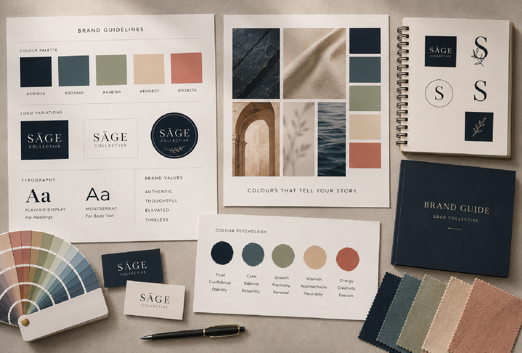
Have you ever noticed how certain brands immediately feel luxurious, trustworthy, energetic or calming? Often, that reaction happens before you have even read the words.
Colour is one of the most powerful elements of branding. It can influence emotions, shape perceptions, attract attention and help customers recognise your business. The colours you choose can say a lot about your brand before you have said a single word.
At Butterfly Creative Concepts, we believe colour should be more than a design preference. It should form part of a considered brand strategy that communicates who you are and connects with your audience.
WHY COLOUR MATTERS IN BRANDING
The right colour palette can help your brand:
- Create an emotional connection
- Communicate your personality
- Stand out from competitors
- Strengthen brand recognition
- Influence how customers perceive your business
- Create consistency across your marketing
Colour can be particularly powerful when combined with strong typography, imagery, messaging and design.
WHAT DIFFERENT COLOURS CAN COMMUNICATE
While colour associations can vary depending on culture, industry and personal experiences, certain colours are commonly linked to particular emotions.
🔴 Red is often associated with energy, passion, excitement and urgency.
🔵 Blue can communicate trust, professionalism, reliability and security, making it a popular choice for many corporate brands.
🟢 Green is commonly associated with nature, growth, health and sustainability.
🟡 Yellow can create feelings of optimism, positivity, creativity and friendliness.
🟠 Orange often communicates enthusiasm, confidence, creativity and approachability.
🟣 Purple can suggest creativity, individuality, luxury and sophistication.
⚫ Black is frequently associated with elegance, authority, luxury and sophistication.
⚪ White can communicate simplicity, cleanliness, openness and modernity.
The important thing is not to choose a colour simply because you like it. Your colours should reflect your brand, your audience and the feeling you want to create.
YOUR BRAND COLOURS SHOULD HAVE PURPOSE
Choosing your brand colours is about more than following the latest design trends.
Ask yourself:
- Who is my target audience?
- What does my brand stand for?
- How do I want customers to feel?
- What makes my business different?
- What colours are commonly used by my competitors?
The answers can help you develop a colour palette that feels authentic to your business while helping you stand out in your industry.
CONSISTENCY BUILDS RECOGNITION
Once you have established your brand colours, consistency is key.
Your colour palette should be used across your:
- Website
- Social media
- Email marketing
- Advertising
- Business stationery
- Packaging
- Brochures and other printed materials
When customers repeatedly see the same colours associated with your business, they begin to recognise your brand more easily. Over time, this familiarity can help build trust and make your business more memorable.
COLOUR CAN INFLUENCE ACTION
Colour can also play an important role in marketing and advertising.
For example, carefully selected colours can help draw attention to important elements such as buttons, special offers, headlines or calls to action. On a website or social media graphic, colour can help guide the viewer’s attention and make information easier to navigate.
However, colour works best as part of a bigger strategy. Great design, clear messaging and a strong user experience all need to work together to turn attention into action.
HOW BUTTERFLY CREATIVE CONCEPTS CAN HELP
At Butterfly Creative Concepts, we look at the bigger picture when developing a brand. We consider your business, target audience, industry, competitors, personality and positioning to create a visual identity that communicates the right message.
From logo design and colour palettes to websites, social media, advertising, packaging and print, we ensure your brand looks and feels consistent wherever your customers encounter it.
CONCLUSION
Colour is not simply about making your brand look attractive. It is a powerful communication tool that can influence perception, create emotion and strengthen recognition.
The right colours can help your business stand out, connect with your audience and create a memorable brand experience.
Your brand deserves colours that do more than look good—they should tell your story.
Partner with Butterfly Creative Concepts to create a brand identity that captures attention, communicates your values, and leaves a lasting impression.
🦋 info@butterflycc.com
🦋 +27 (82) 826 5714


